Looking to create a central hub for the entire country, Ford Canada engaged RD2 and Sonic Boom to help craft a unique and beautiful vehicle for delivering content and spreading conversation around the Brand to the audience. Taking Canadian mobile data usage into consideration, Phase 2 of the blog quickly followed the launch of Phase 1 in order to ensure that all users had a way to consume content, engage in conversations, and touch, swipe, pinch and tap the Ford experience in a way that is truly revolutionary.
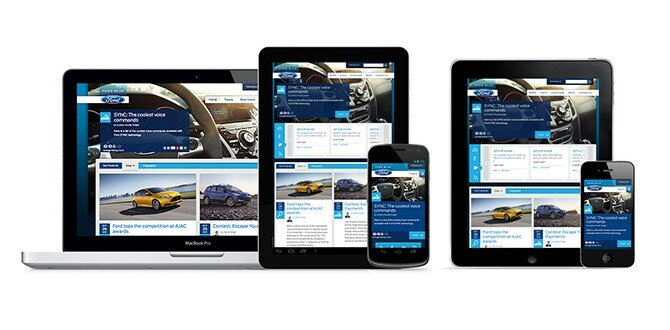
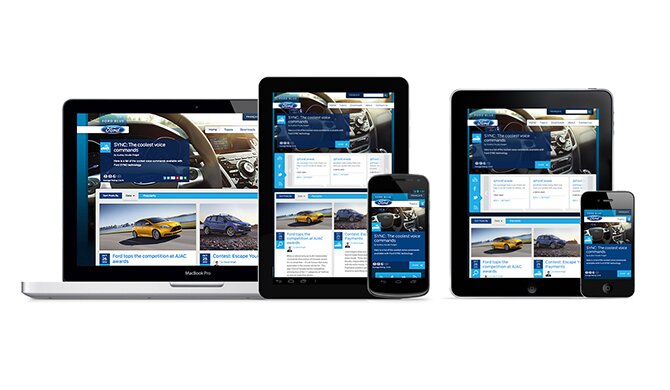
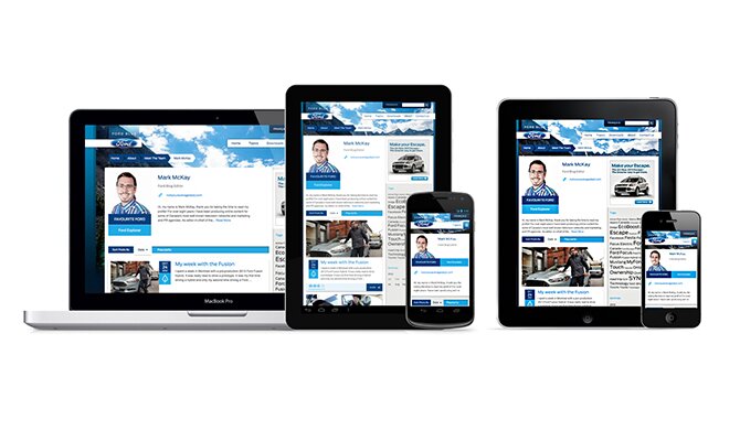
Not wanting to limit their content to only desktop users, Ford Canada, RD2 and Sonic Boom engineered the Ford Canada Blog to be Responsively Designed – fluid and adaptable, creating a unique and customized website experience no matter the device consumers wish to use.
What is Responsive Design?
Responsive Design is the new website design methodology that allows a single website to have an infinite number of different and unique ways of delivering content in a customized and device-specific way. Each user, regardless of the device they use to view the website, can now get a version that is specifically appropriate for them.
Smartphone and tablet penetration into the digital landscape and daily routines of the average user have experienced “hockey stick” growth in last two years. With, according to Canalsys, PC sales being eclipsed by smartphone and tablet sales for the first time in history (by a staggering 150+ million devices in 2011), the expectation and demand of users to have content at their fingertips is deafening. Websites now have to work on iPhones, Android smartphones, iPad, Nooks, and a whole host of Internet accessible devices. Responsively Designed websites can determine the differences between all these devices and then deliver the best possible website for the user to view, digest, and engage in the content.
The Road Less Traveled
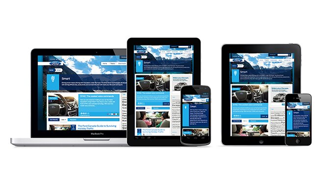
The road to creating a Responsively Designed website is still an unpaved swath riddled with many potholes and challenges. While a lot of newly redesigned websites seek to avoid pitfalls by limiting the amount of breakpoints or minimizing design, this execution reflects just the opposite. We wanted to increase the value to the customer and introduce more features. Specifically, in addition to updating the website to being fully responsive, the following functionality has been added:
- Multilingual advertising integration with page-specific targeting options
- Featured article option specific to each topic
- Restructuring of post creation and content categorization
- Custom theme options for Individual topic pages
- Custom theme options for Individual article pages
- Creation and integration of variable survey/promotional widgets
- Creation and integration of variable advertising/related content widgets
- Updates and improvements to proprietary Social Flyout Ticker
- Custom wallpaper integration and downloads
- Survey integration and customization on a per post and per topic basis
- Enhanced “Related Articles” options and controls
- Updated sharing and socialization options
- Enhanced Search features throughout website
- Enhanced RSS subscription options
Road Hazards
We knew from the beginning that there would need to be a considerable amount of time dedicated to planning, information architecture and UX in addition to the Design and Development time. In doing so, we pinpointed several issues that we knew to be more challenging than the others.
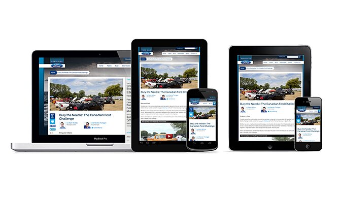
- Advertising and Cross-Promotion. Looking to highlight events, specials, promotions, and other campaigns within the Ford Universe, Phase 2 was designed to include special advertising and cross-promotional spaces that existed in a variety of places throughout the website.
- Mobile Data Limitations. The complex, image-heavy nature of the website could cause serious issues for users that had anything less than a high-speed connection on their tablet or mobile devices.
- Oui s’il vous plaît. In addition to English content, Ford Canada has to also be able to selectively serve content in French.
- Serving content on multiple websites. Much of the content from Ford Canada is distributed to other websites via WordPress multi-site.
- Javascript and processing power limitations. Compared to a tablet and mobile phone users, desktop users have infinitely more processing power and screen real estate. How would Social Media Flyout translate to smaller, less powerful devices?
Making it Purr
Advertising and Cross-Promotion.
Looking to introduce surveys, advertising and cross-promotions into the new website, the directive from Ford Canada also mandated that these spaces to have options to be activated, deactivated, and swapped out for a variety of options (e.g. One space could be used for one or two ads, a survey, or a Related Post feature). Advertising-related features and functions needed to be easily managed from within the website, and of course, work in a responsive environment.
To make things easy and error free as possible, we opted to use standard advertising dimensions even though the client was willing to provide custom-sized ads. By creating custom ad zones (more coming soon on this topic), based on a predetermined priority scale and in tight integration with third-party ad serving platforms, like OpenX, we were able to to create variable promotional spaces that are organized and shown based on their relative importance and the user’s available screen real estate.
As an example, if a user visits the website on their Android-based Samsung Galaxy S2 in portrait mode, based on their screen size of 480px wide, the website will deliver the maximum number of promotional spaces, a total of up to three. If the user then rotates their phone into landscape mode, making the available screen width 800px, they will now see up to six promotional spaces. Additionally, we built in the foundations for our Future-selves to be able to more easily target advertising based on the target device.
Mobile Data Limitations.
Even though every carrier now touts how fast their newest data programs are, we all know too well the pangs and griefs of mobile data. Slow or non-existent data speed is a significant factor that many websites still fail to factor when creating a Responsive Design. In order to help deliver the most appropriate content as fast as possible, we employed several techniques, many starting at a server level. Most notably, we used a unique combination of CSS, PHP device and browser detection, and custom cache delivery techniques to deliver as much or as little content, javascript, and images as the viewing device can handle. In doing this, we’ve minimized load to both the web server, as well as the user’s device and data plan. We expect both the client and the cell phone carriers to thank us.
Oui s’il vous plaît.
Officially bilingual since 1867, Canada has two national languages: English and French. While content creation in different languages isn’t new, dealing with the variations in word length, ensuring Ford Canada had the ability to have select content available for each website, and allowing Ford to have two URL structures is something that took a little thought. To accomplish this, we worked extensively with French translators to ensure that we were using the best possible translations. The other half of the battle was won by working just as extensively with WMPL (WordPress Multilingual Plugin) and their developers to enhance and tweak to allow for the features requested by Ford Canada.
Serving content on multiple websites.
While it may not be obvious at first glance, the Ford Canada blog, “Blue,” serves up content to multiple websites, all having their own French components. As part of Phase 2, we restructured the article categorization mechanics and the main navigation to allow Ford unfettered options to add both Topics as well as Sub Topics by simply adding articles. The creation of a new article in a new topic automatically adds a new Topic and a new menu element. The new article categorization mechanics also allow articles to have multiple Topics assigned to them, while only showing the appropriate Topic on the satellite website or even on another page within Blue. This allows the content to travel through all of the websites, and even to different places within the blog itself, seamlessly. BONUS: We gave Ford Canada the option to update the Topic icons at any level throughout Blue with ease and simplicity.
Javascript and processing power limitations.
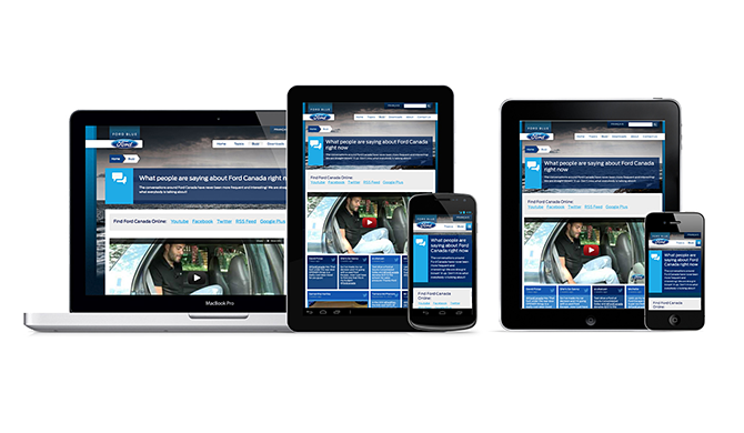
As part of Phase 1, we built a custom Social Media Flyout that opens up to showcase the latest tweets, Facebook posts, and YouTube videos published by Ford Canada. When not open, it also quietly keeps count of these updates for the user while they are on the website so the user has a running ticker of what they might be missing elsewhere. As part of Phase 2, we were challenged to bring this functionality to tablet and smartphones. Neither device has as much processing power as a typical desktop, but the average tablet has considerably more than the average smartphone, along with a better web rendering engine to boot. With this in mind, we knew the current iteration of the Flyout wouldn’t “fly” on most smartphones and only a select few tablets due to the javascript and heavy styling demands. In order to deliver the same social updates to as many users as possible, the browser detection and cache settings that we employed to minimize website load times were also used to determine the user’s browser type (desktop VS phone VS tablet) and present them with the appropriate version.
Under the Hood
Besides the usual sweat and tears, Phase 2 of the Ford Canada blog employed the new RD2 Framework which pushes the boundaries of browser technology. We used the latest in HTML 5 markup, and CSS3 features to provide the most optimum user experience for every device and computer.
Libraries
In addition to custom code, the RD2 Framework leveraged many existing libraries to assist in the delivery of this project. A few of those technologies were:
- Modernizr – Gives support for HTML 5 and assists in detecting browser fallbacks for all the latest technology we utilized in building the foundation for Ford Canada.
- jQuery – The most popular JavaScript framework, jQuery is a fast and concise JavaScript Library that simplifies HTML document traversing, event handling, animating, and Ajax interactions for rapid web development. In short, jQuery helps Ford Canada achieve all the cool stuff they wanted.
- – Brings CSS3 Media Query support to older versions of Microsoft Internet Explorer 6-8.
- CSS3 PIE – RD2 utilized many new CSS3 techniques in the building of Ford Canada, and CSS3 PIE gives support to Internet Explorer versions 6-9.
- Selectivizr – Gives support for CSS3 pseudo-classes and attribute selectors in Internet Explorer 6-8.
- FitVids.js - YouTube videos embedded on the website by default have a set width and height. We needed a way for those videos to be fluid on any device or computer. FitVids.js allows us to make those video players flexible for any device and any size. For more information on how this is done, you can visit our tutorial.
- – When it comes to building a responsive website like Ford Canada Blog, utilizing only CSS media queries is just not enough. Enquire.js allows us to use HTML 5 MatchMedia to trigger JavaScript at our designated breakpoints to provide a seamless user experience at any breakpoint.
Take a Test Drive
Be sure to let us know what you think!
[...] at RD2. First, Ford Canada’s Blog, which was done in two languages and is fully responsive. Read more about the redesign. There’s also a nifty Easter egg. See it for yourself: up up down down left right left right [...]