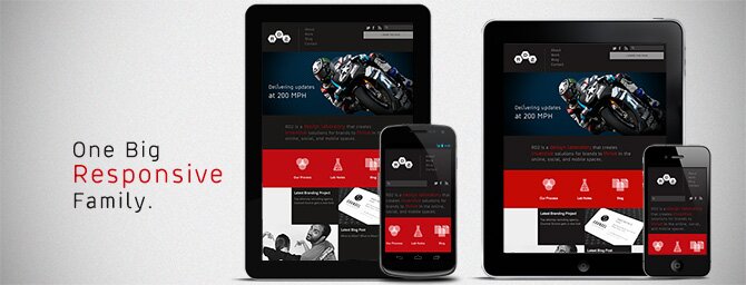
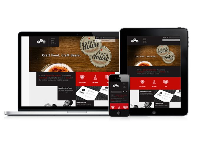
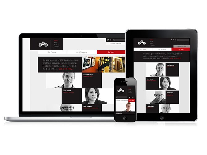
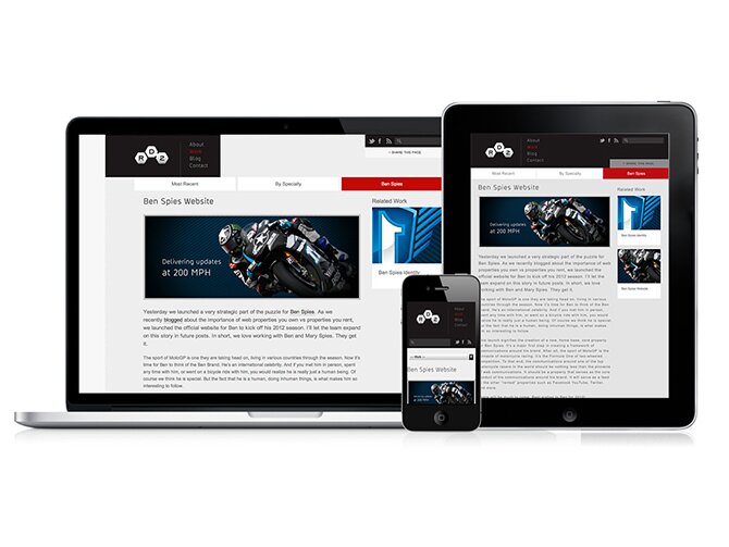
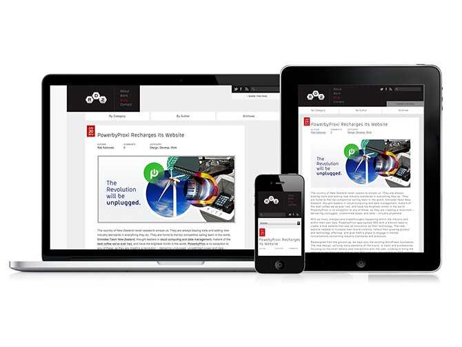
It’s a sign. A signal that something special is happening at RD2. Today we’re rolling out something for ourselves and that is altogether different for us. Typically we’re the last to get the good stuff, but this time it’s different. We wanted to be the test subject. This version of our website offers a glimpse of our new framework that we’ve been building as a WordPress add-on. Known in our industry as “Responsive Design,” this version of our website takes on a new design approach.
No matter what your website is all about, chances are if you look at your google analytics over the past few years you will notice new device types (mobile devices) are requesting content from your website. The statistics around how humans are consuming content today are simply astonishing (Source = Smart Insights):
- By 2014, mobile internet users will exceed desktop internet users
- On half of all local web searches are now occurring on mobile devices
- 86% of mobile internet users access the internet through their devices while watching TV
- On average, Americans spend 2.7 hours per day socializing on their mobile devices
- 29% of mobile users are open to scanning a mobile tag or QR code to get deals
With all of this activity happening on a mobile device, why should our user experience suffer when we access web content while away from our desktop or laptop machines? After all, we have these fancy devices now with Super AMOLED and Retina displays in our pockets. Some of our small devices even have more pixels than our big HD TV screens at home. So, it only makes sense that we should be able to take advantage of these incredible technologies. We should be able to experience websites (in addition to mobile apps) that rebuild themselves based on the screen sizes and resolutions that are viewing them. Content on websites should reorganize itself to accommodate those smaller sizes, so that it makes sense rather than just squishing the same layout into a small device screen. Websites should modify themselves to leverage touch gestures when they are reduced in size.
We think this is the new norm. So, today we are revealing one attribute of our new framework that helps the websites we build to be responsive. And we’re testing it on our own website so that we can perfect our methods. And we’re building everything we know and learn into our new framework so we can share it with our clients.
Great team effort by everyone involved on this project. Very proud to be able to align myself with the people who made this happen.
Very exciting indeed! Great work.