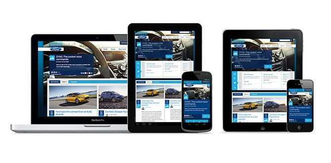
Looking to use of the Ford Blue blog as a destination URL for their advertising and promotional campaigns, RD2 was tasked with creating a branded page that was in sync with the recently launched “Going Wild” campaign for the 2013 Escape. Luckily for us, there was more than enough good content to work with. Centered around the unlikely pairing of a rugged outdoorsman and his “over bear-ing” companion,
Launch: Maxava maximizes availability with a new responsive website design
Maxava is a company that is based on responsiveness. Their products help companies react with agility, “when every second counts for high availability.” The case studies of Maxava tell amazing stories about the challenges companies face today in the world of high available data.
When Maxava approached RD2 to help them update their website, we knew their next website had to be accessible to as many people as possible – it had to be responsive. Given the complex nature of their business however, crafting a new responsive website design involved a substantial UX effort to make sure that all content that was accessible on the desktop was also accessible on any device...
Launch: RD2 crafts a new responsive website design for The Funding Network, Australia.
RD2 just crafted and launched a new responsive website design for Australian addition to The Funding Network. The Funding Network is a UK based non-profit that takes a unique approach to raising funds for other non-profits…LIVE crowd funding. Having had great success in the UK, the Australian branch is one of several offshoots meant to expand their ecosystem of giving.
With initial setup and funding still in it’s infancy, the Australian arm contacted RD2 to help quickly establish their online presence in a way that was in-line with their published promotional materials, and that would help build buzz about new projects...
Tips & Tricks: Creating better textures using CSS3 gradients
There are two fundamental elements that make up our world and how we understand the information in it: Texture and Color Gradients. These two elements play a vital role in telling us all sorts of information like whether an orange is ripe or whether a button on a website is clickable. In the world of the Web, texture is commonly known as “noise”. Despite it’s prevalent use around the Web, producing noise has always been cumbersome, clunky, graphic intensive.
Creating NoiseNoise is often used to help users distinguish important information from less important information. It is also used to give a website a unique feel or effect...
Responsive Website VS Mobile Application
As more and more consumers make smartphone purchases, the arguments around the “New Web” escalate. The most heated being the debate about mobile apps VS responsive design. Which is best?
Native mobile app pundits all heard Mark Zuckerberg loud and clear when he made his famous statement about going to a native mobile app vs HTML5...
Giving Bugzilla a monster makeover.
We use Bugzilla a lot here at RD2. It is a great tool for tracking website and app issues, assigning tasks, and all round helping us get projects from Development to Launch. Unfortunately, especially for those of us that are more design oriented, it’s lack of aesthetics is almost unbearable...
Ford Canada Blog Phase 2: Going Further

Looking to create a central hub for the entire country, Ford Canada engaged RD2 and Sonic Boom to help craft a unique and beautiful vehicle for delivering content and spreading conversation around the Brand to the audience...
Grounded for Enhancements
When you’re Southwest Airlines and you’re running one of the most recognized and awarded corporate blogs, you take your website performance and updates seriously. As the main portal for news and culture, Southwest wanted to make sure their users were getting the best experience from their website...